EDITORIAL # 29
MICHELLE COTTON / NO IDEAS BUT IN THINGS
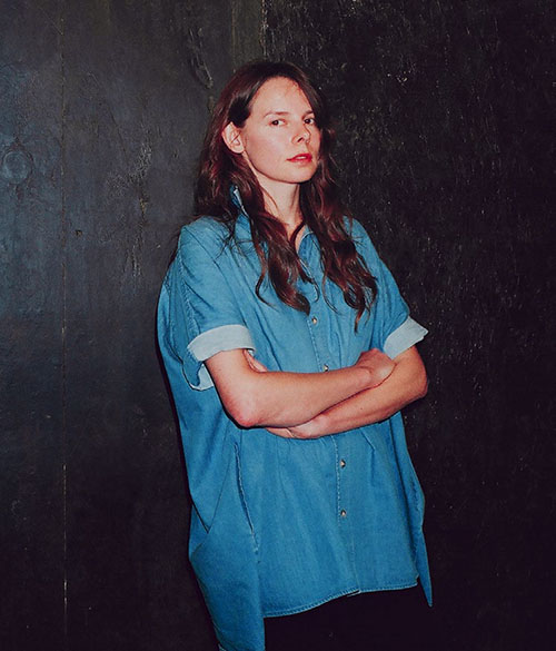
‘No ideas but in things’ is an often quoted phrase from the opening of William Carlos Williams’ poem, Paterson (1946-58). Williams was associated with the Anglo-American ‘Imagist’ school of poetry who advocated the ‘direct treatment of the “thing”’ without ‘false ornament’, a precision with language and economy of form. Unusually, Williams was also a physician and paediatrician. Known to the people of Rutherford, New Jersey as ‘Doc Williams’ he often drafted his poems on prescription pads between his appointments. He was also the childhood doctor of the artist Robert Smithson, who once described Paterson as ‘a sort of proto-conceptual art’. I have written about all of this before, in another text published by the ICA in London in 2009 that uses the same phrase from Paterson as its title.
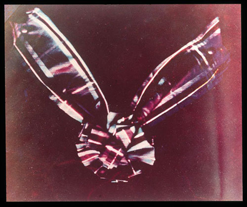
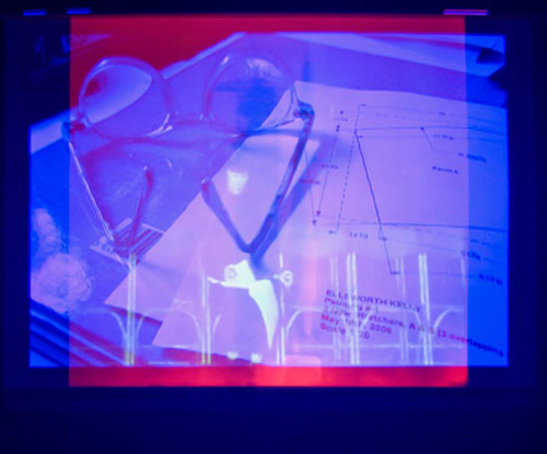
As a student I spent a lot of time thinking about the parallels and differences between art and literature. I still spend a lot of time thinking about the mechanics of each, how art adopts and evades linguistic structures and communicates ideas in images or things. The image of a tartan bow shown here was the first colour photograph. It was created by the Scottish scientist James Clerk Maxwell in 1861 who made three separate exposures through red, green and blue filters and projected each on top of one another through separate magic lanterns with the same coloured glass. The image was part of an exhibition that I curated with Emma Robertson at The Approach in London in 2008, it also appears as a more oblique reference in a film called Thre Stryppis Quhite Upon ane Blak Field (2010) by the artist Nick Relph.
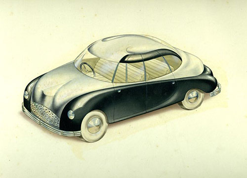
Perhaps it is this interest in how something activates or changes something or someone or how we communicate ideas that has led me to draw connections between art and other fields such as science or design. In 1944 Naum Gabo designed a car for the British firm Jowett. It was the first project of the newly-formed Design Research Unit, the first multidisciplinary design studio in the UK, which was at that time a lose collection of architects, graphic designers and industrial designers led by the art critic, poet and anarchist Herbert Read. The design reflects Gabo’s sculpture from that period in both form and materials, he even incorporated Nylon and Perspex, two new products that appeared within his work before they became widely available for the mass market. However, Jowett deemed it too impractical for production and cancelled the contract the following year.
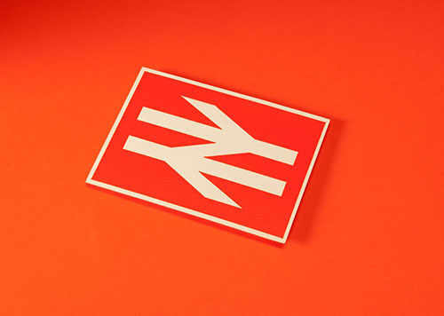
By the 1960s the Design Research Unit were working on some of the first corporate identity schemes produced for British industry. The corporate identity programme for British Rail was the largest and most complex project of its time. This symbol was introduced in 1965, replacing an assemblage of national symbols (a lion and crown) and an antiquated idea of travel (a cartwheel) with an abstract representation of speed. British Rail was broken up into numerous private franchises in the 1990s but the symbol is still in use. Here it appears on an invitation produced for the Council of Industrial Design’s exhibition of the new identity in 1965. I found this card amongst some other papers whilst I was working on an exhibition and book about the Design Research Unit.
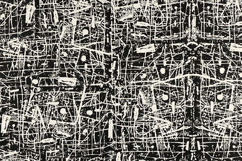
A lot of people seem to think that I moved to Germany from London but actually I lived in a rural backwater in Essex called Landermere Quay. From the mid 1950s it was home to the families of the Independent Group artists, Nigel Henderson and Eduardo Paolozzi who set up a design studio there called Hammer Prints and began producing wallpapers, textiles and ceramics. ‘Sgraffito’, one of their first designs from 1955, was made, as its name suggests, by scratching into a block of plaster. This was then printed with ink and photographed to make a repeat pattern that was screen-printed onto wallpaper and textiles. The design shows the influence of American Abstract Expressionism and Surrealist techniques, it also encapsulates what their friend Reyner Banham called the ‘New Brutalism’.
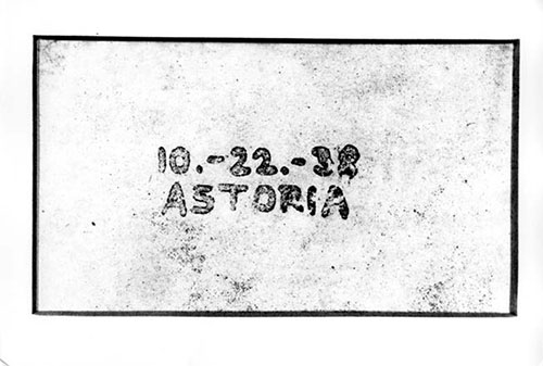
The first photocopy was produced on 22 October, 1938 in the Astoria district of Queens, New York. It was made by Chester Carlson, a patent attorney from Seattle who spent a lot of his working life copying drawings and specifications and became obsessed with the idea of creating a machine that could do this for him. The machine took another 22 years (this copy was produced using India ink, a glass microscope slide, lycopodium powder, an incandescent lamp and an electrostatic charge) but Carlson’s experiment demonstrated the principles of what was subsequently named ‘xerography’, from the Greek xeros (dry) and graphia (writing). The story of this prosaic piece of office equipment and the role that it has played in art over the last 55 years was the subject for a large exhibition (entitled ‘Xerography’) that I did at Firstsite in Colchester in 2013. There were over 100 works by 40 artists including Carl Andre, Thomas Bayrle, Mel Bochner, Alighiero Boetti, Hanne Darboven, Sol LeWitt, David Hockney, Sarah Lucas, Sigmar Polke, Jim Shaw, Josh Smith, Barbara T Smith, Wolfgang Tillmans, Rosemarie Trockel and Stan VanDerBeek but I still missed a lot of things and I would like to make a larger version of the exhibition. Perhaps if photocopiers are still remembered in 2038 I can make a centenary version.
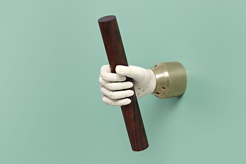
It was interesting to see how different generations of artists used the copier according to their interests and to consider their diverse output in relation to a machine and its history. It was also interesting to see the impact that it had on culture in the 1960’s. I am convinced that the photocopier helped give form to Conceptualism, it was quite literally a machine built for monochromatic seriality. More recently I have been reading about the history of Artificial Intelligence and thinking about how developments in computer science have inspired and influenced generations of literature, film and art. For example works by Aleksandra Domanovic that make reference to a robotic hand prosthesis designed by a Serbian scientist, Rajko Tomovic in 1963 and often refered to as the ‘Belgrade Hand’.
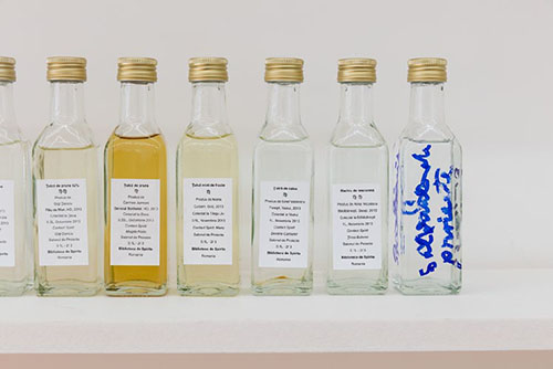
When I lived in London I spent a lot of time in libraries, I still prefer to find my information in books rather than online. These days I spend more time in Bonner Kunstverein’s Artothek. I have only seen a fraction of the collection but there are some great works by Hanne Darboven, John Stezaker and even Man Ray. The Library of Spirits is a work by Banu Cennetoglu who will be exhibiting at the Bonner Kunstverein in November. It comprises of an assortment of 115 homemade alcoholic drinks that were produced and collected in Romania in 2013. The piece maps a geographical area by exploring a clandestine yet widespread culture of home-distilled alcohol. Each bottle is labeled with the fruit that it was made from, the name of the person who made it, the place and date of distillation and the ‘Contact Spirit’ (the person who led Cennetoglu to the source). The ‘Contact Spirits’ are often people that she met along her journey but she also credits Franz Kafka and Constantin Brancusi whose birthplaces were part of her route. Cennetoglu made a second such library in South Korea for the 10th Gwangju Biennale last year. Unfortunately we couldn’t make another version her exhibition at the Kunstverein as alcohol production is too heavily regulated in Germany but I’m sure that there will be others in the future.
Michelle Cotton, September 2015
